Case Study: rebel
From legacy retailer to modern icon
From legacy retailer to modern icon
When Rebel Sport—one of Australia’s most recognised activewear retailers—needed to evolve, the challenge wasn’t just aesthetic. It was emotional, commercial, and cultural.
The brief was to modernise the brand without alienating its loyal base. “Sport” was no longer sufficient to describe the business’s direction; the brand needed to speak to broader lifestyle aspirations, not just performance. But dropping the word “Sport” meant walking a tightrope: retaining brand equity while signalling change.
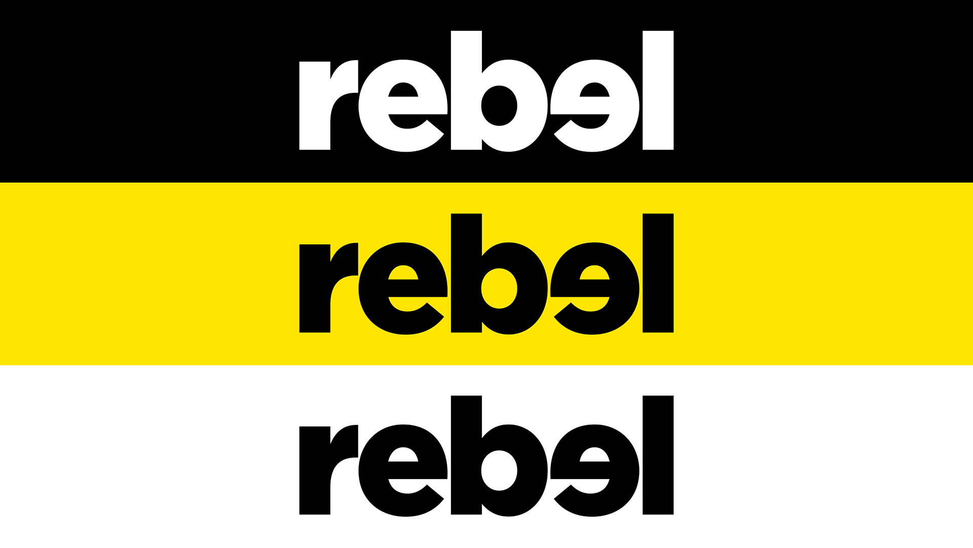
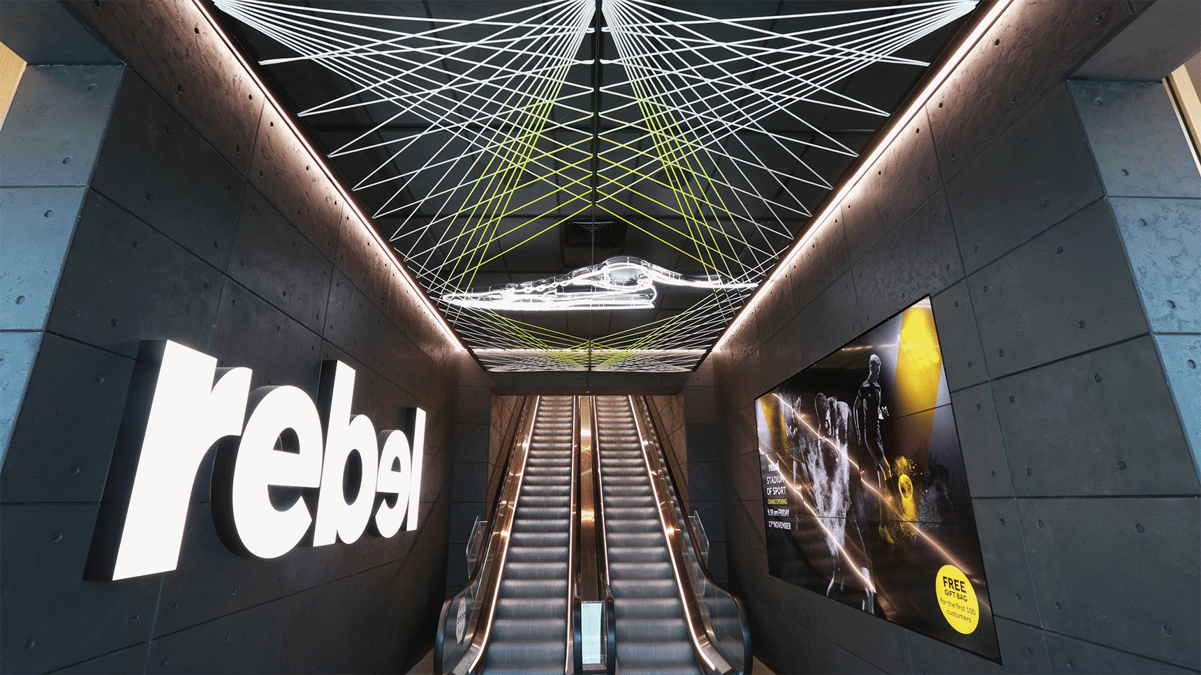
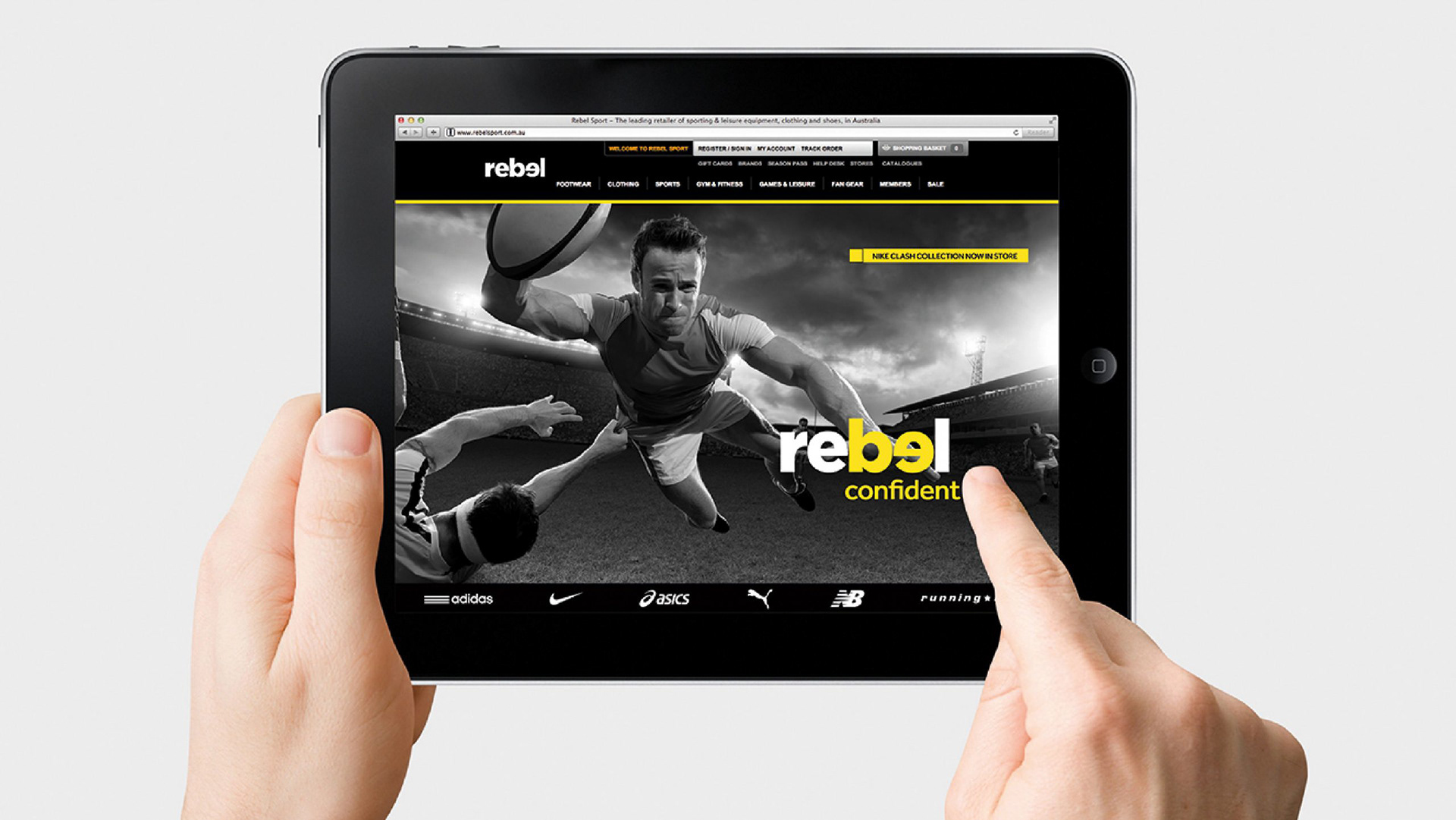
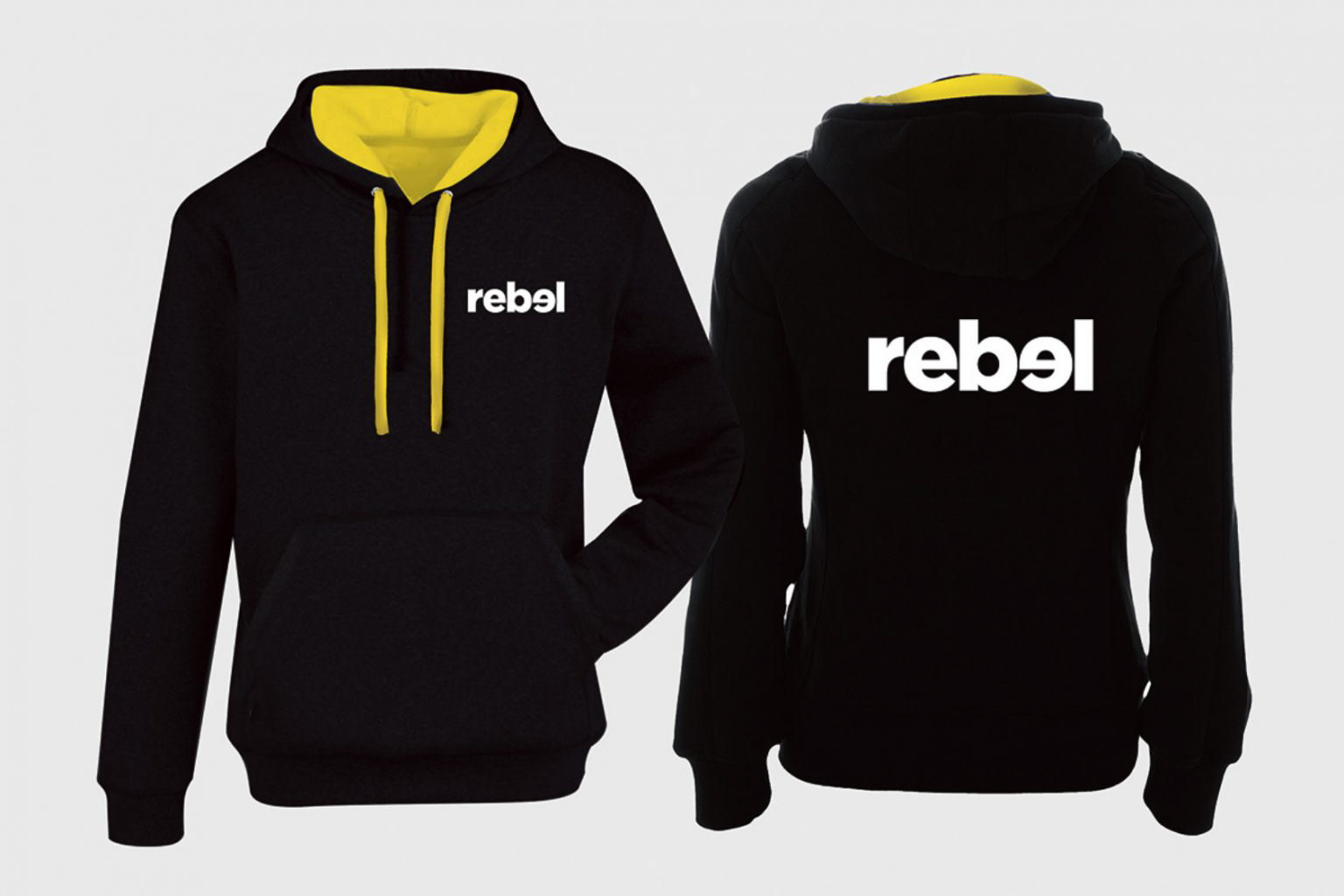
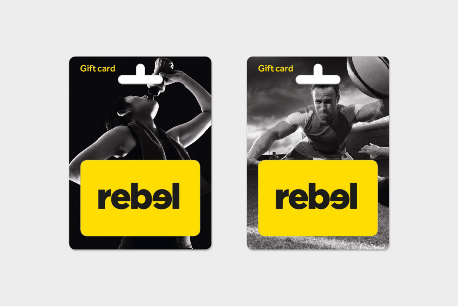
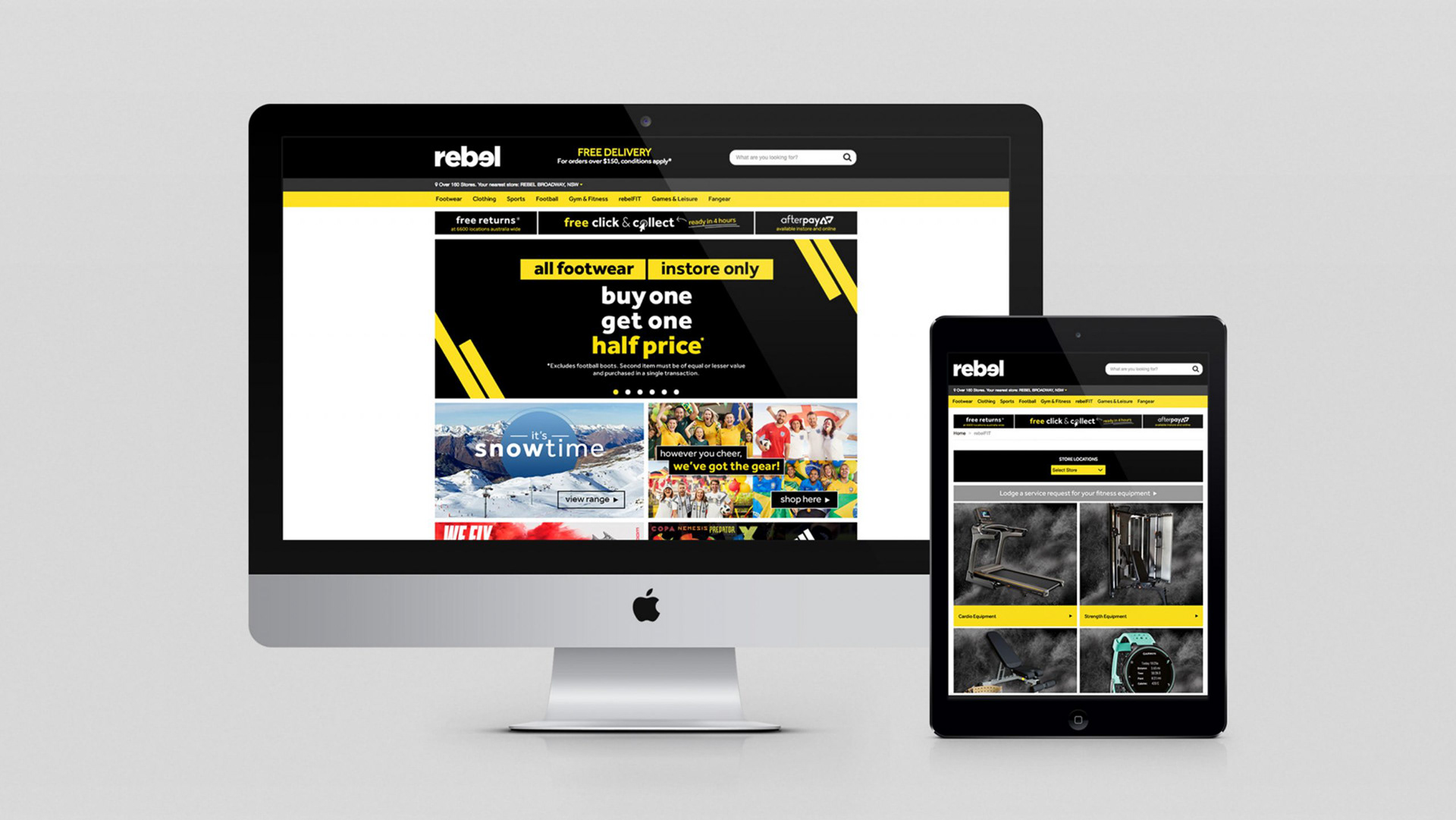
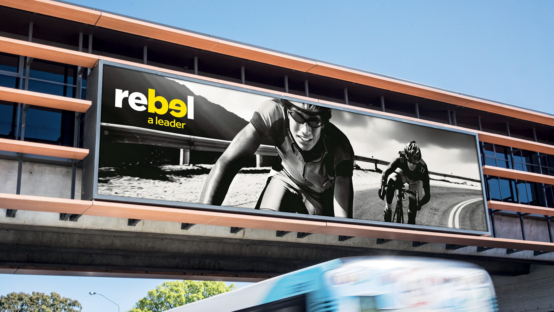
We introduced a new identity: rebel. Lowercase. Confident. Contemporary. The design language shifted from loud and promotional to bold, editorial, and aspirational. We developed a cleaner visual system, refined the tone of voice, and introduced clearer segmentation across categories to serve athletes, weekend warriors, and style-conscious shoppers alike.
But the change wasn’t just seen—it was felt. In-store environments, staff uniforms, and digital touchpoints were all reimagined to reflect the new rebel mindset: active, inclusive, and progressive.
The result? A brand with stronger relevance, deeper resonance, and renewed commercial momentum. Rebel was no longer just a place to buy sport—it became a place to belong in the world of sport and lifestyle.

Case Study: Verve
From blank page to premium wellness brand
From blank page to premium wellness brand
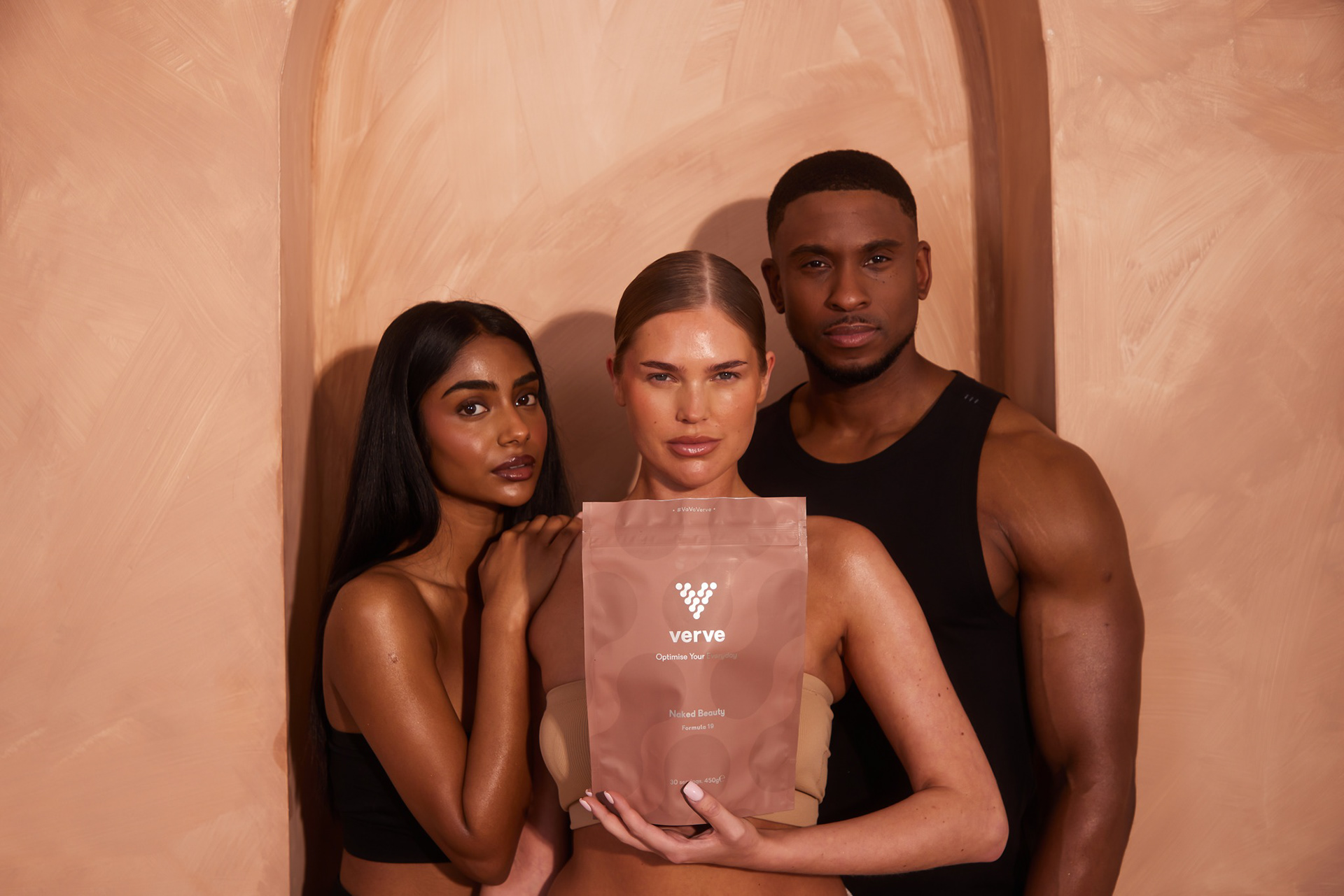
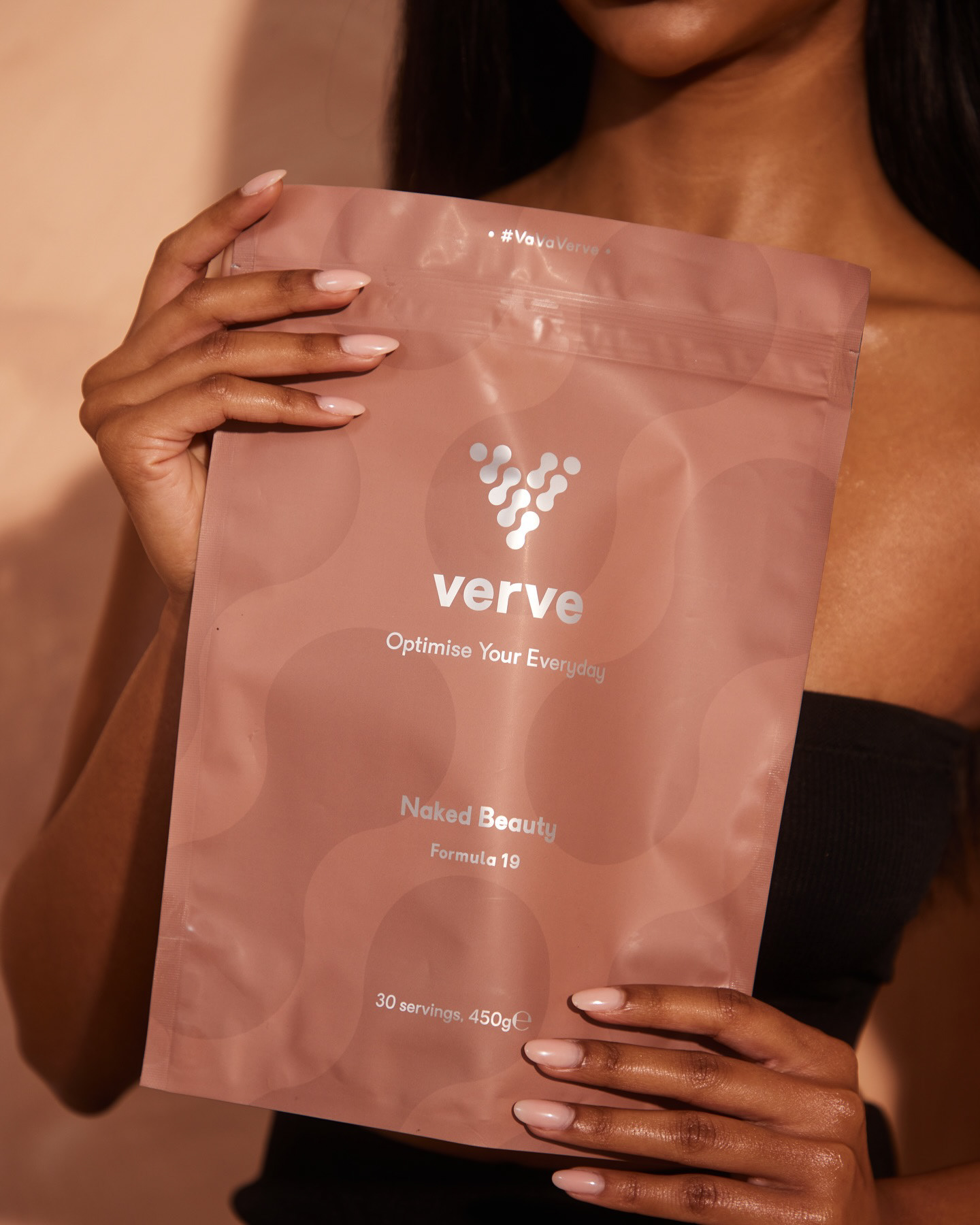
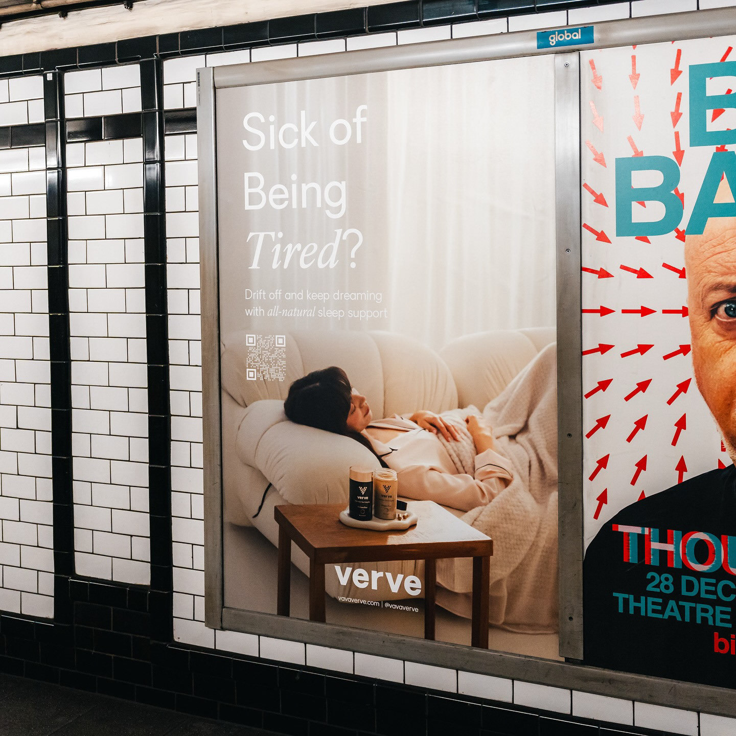
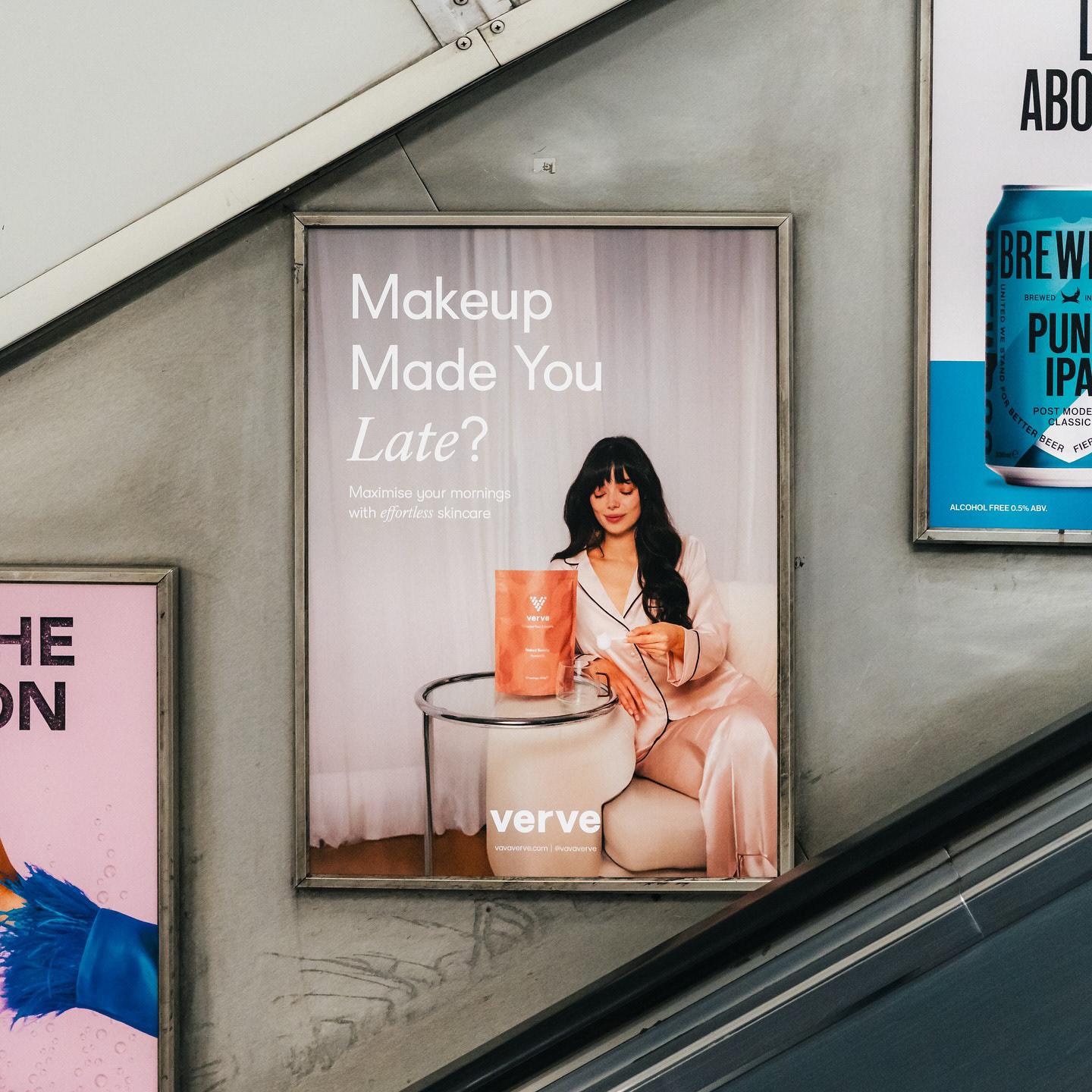
Verve - also known by its rallying cry VaVaVerve - was built to cut through a category drowning in noise. Where most wellness brands leaned soft and vague, we set out to build something with sharper edges: a brand that fused clinical credibility with cultural relevance, and dared to be both premium and punchy.
Starting from scratch, I led the brand from concept to shelf - defining strategy, name, visual identity, packaging, voice, and go-to-market rollout. At its core was a clear positioning: Verve was created for high-functioning humans who want to optimise their everyday - a tagline I developed to capture the brand’s unique promise. It grounded the entire identity: active, aspirational, and achievable.
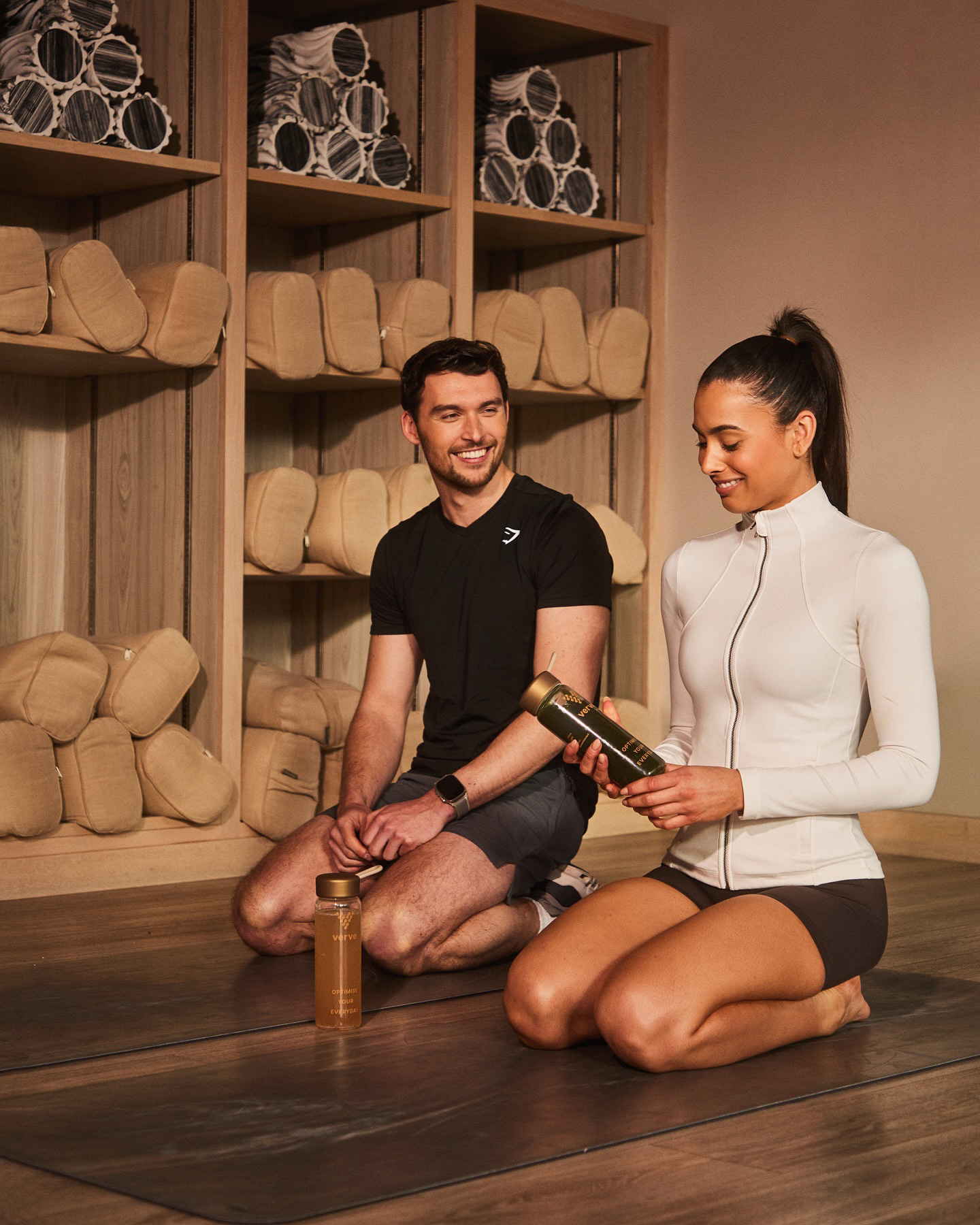
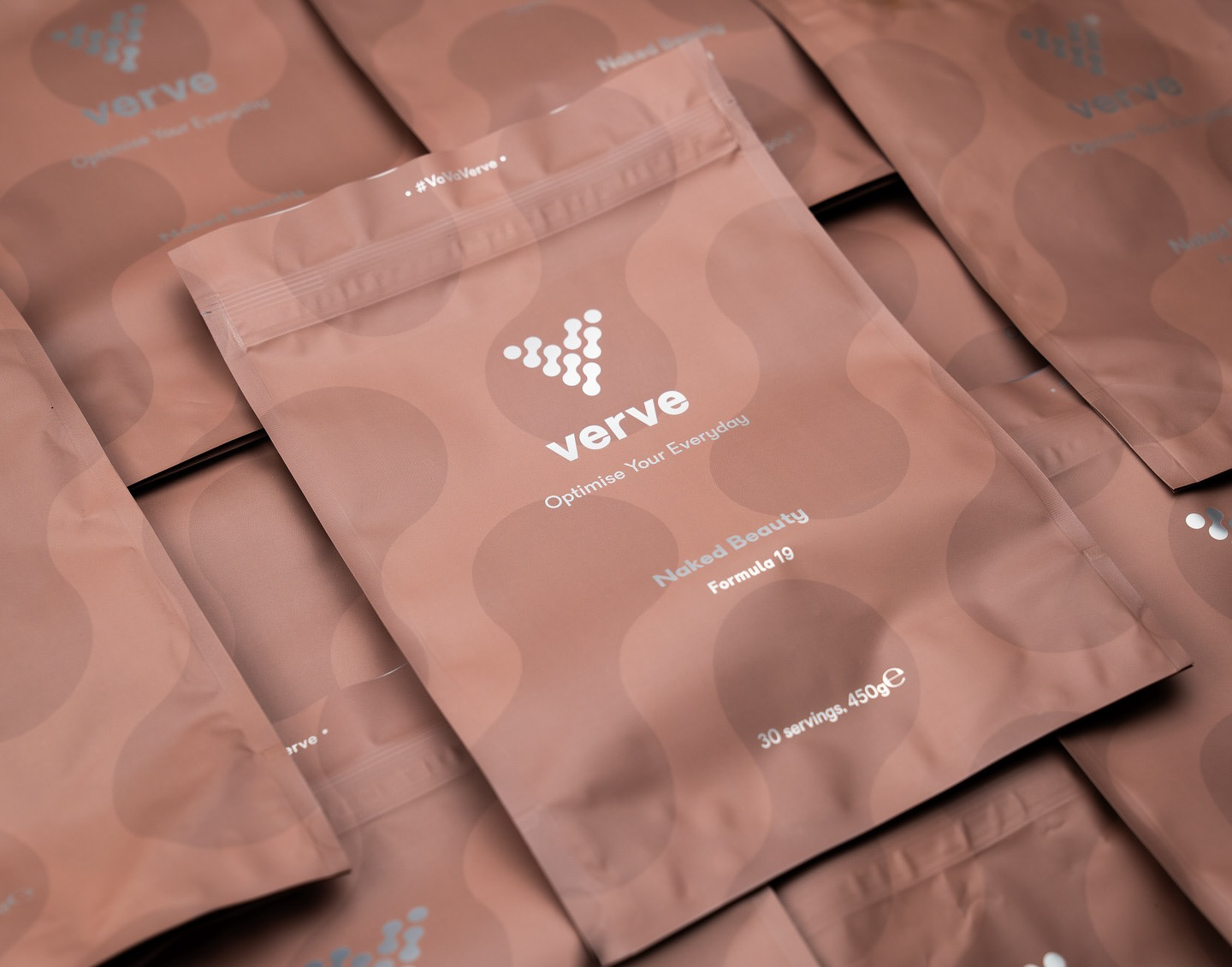
The name Verve spoke to energy, vitality, and style. VaVaVerve gave it movement - a signature phrase and brand asset in one. Visually, we designed a world that felt rich and intelligent: deep jewel tones, bold serif typography, and clean, clinical layouts. The design signalled quality; the tone of voice delivered confidence with warmth.
Every element reinforced the brand's philosophy: daily performance comes from daily choices. Verve’s product architecture, packaging design, and copy all reflected that belief - offering modern wellness rituals that worked hard without shouting.
The result was a standout success. Verve didn’t just look different - it thought differently. By combining strategic intent with design precision, we created a brand people could trust, desire, and integrate into their everyday lives.